
CLIENT:
MY ROLE:
TEAM:
Arcana (candid project)
UX Research, UX/UI Design
Solo Project
DELIVERABLES:
User & Market Research
Prototype
High-Fidelity Mockups
OVERVIEW
ABOUT ARCANA
Arcana is a specialty art book store in Culver City, Los Angeles, carrying over 100,000 curated items. They also have an e-commerce website.
WHAT DO THEY SELL?
Unique art books, vintage periodicals, auction catalogs, posters, poster cards, digital media, collectibles and limited edition items.
WHO IS IT FOR?
People interested in the arts & creative people who need art books for inspiration, decor or gifting
CHALLENGE
Many people are drawn to the convenience of online shopping but dissatisfied with the discovery experience of specialty books. They need the unique curation and display of products that specialty book stores have to offer but often face poorly organized inventory online.
How might we improve Arcana’s online experience to better reflect their experience in-store?
SOLUTION
A re-design of Arcana’s website to improve the organization and presentation of Arcana’s unique offerings online.
I designed a website for Arcana with restructured information architecture, navigation and discovery methods to emulate the in-store experience at Arcana, allowing customers to not only find what they are looking for but also organically discover products along the way.
DESIGN PROCESS:
RESEARCH > DEFINE > IDEATE > PROTOTYPE
RESEARCH
HEURISTIC EVALUATION
First, I reviewed Arcana’s website to identify potential problems with the existing interface. There were many violations. For this case study, I want to focus on the 4 that prevent users from the discovery of products for purchase.

C&C ANALYSIS
Then, to examine how other book stores tackle the organization and display of their online store, I conducted a C&C analysis. Initially, I was only looking at other specialty book stores, but due to a consensus regarding Amazon’s and Barnes & Nobles’ ease of use during user interviews, they were added to the analysis.

All book stores offer multiple type of book features
Products are divided by genre and product categories
They all offer content image samples for image-heavy books
USER RESEARCH
I conducted user interviews with art book shoppers to learn how and why people shop for art books.
"
If I have design project, I'm looking to design within a certain sort of genre
"
Because I want something that is beautiful and just delightful to look at for just about anybody.
"
For work, I research very specific kinds of art.
Why do people buy art books?
"
Art fuels the creative spirit
INSPIRATION
RESEARCH
"
If I buy an art book is because I'm looking for inspiration for my own creative works.
I also asked them to perform a task on the Arcana website so I can see their behaviors in action. I then created the journey map illustrating customer pain points and potential exit points from the site.

DEFINE

Affinity mapping helped me get an overview of who Arcana's customer is. From their, I created a user persona.

Art books are commonly purchased for inspiration and research. Customers have specific subjects in mind when shopping for art books but welcome spontaneous discoveries for new inspirations.
They appreciate the thoughtfully curated selections and unique aesthetic of specialty bookstores but prefer to shop online for convenience. However, their online experience does not match their in-store experience, therefore they settle for what major e-commerce book retailers have to offer.
How might we improve Arcana’s online experience to better reflect their experience in-store?
IDEATE
A re-design of Arcana’s website to improve the organization and presentation of Arcana’s unique offerings online.
INFORMATION ARCHITECTURE
An in-store visit and card sorting with artbook customers helped guide the re-design of Arcana’s information architecture.


-
Since art book shoppers are commonly looking for inspiration material on specific topics and inspiration can come in different forms, the subject matter takes priority over the product type. This was discovered through card sorting and also in-line with my user interviews and store visit
-
I conducted open and closed card sorts, narrowing down the wide range of topics into 3 main categories which will be placed in the primary navigation w/ sub-categories.
Some of my hand sketches

Before
THE RE-DESIGN
HOMEPAGE
CURRENT
• The current homepage is a new & noteworthy page.
• There is a book of the day feature at the top, but it leads you to the blog with no option to purchase
• The navigation is hidden in the hamburger bar
• The customer has to hover over the product to see information on product
• This re-design segments the homepage into multiple sections and added a navbar to embody what Arcana has to offer as a whole.
• The navbar allows access to different sections of the store with ease (See IA for sub-categories)
• Customers can discover through the homepage as well as a featured section in the navbar
RE-DESIGN


RESULT LISTING PAGE
The home screen is a community feed where organizers & volunteers can rally others in their chosen communities.
A discovery section is added containing discovery and urgent needs tabs. Volunteers can search & filter through all of the events posted on Helpers.
CURRENT
• Difficult to differentiate between product types, since results are generated by subject only
• Again you have to hover to find any information about the product
• In addition to the added primary navbar with categories and sub-categories, customers can further refine the result listings with the faceted navigation at the side
• Facet navigation allows you to filter product type, refine subject, and price range
• Within the result listing, there are larger scaled featured book boxes. This mimics the outward-facing featured books on Arcana's in-store shelves
RE-DESIGN


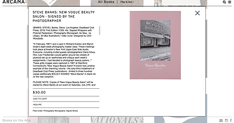
PRODUCT PAGE
CURRENT
• A pop up screen with no sample images of inside the book.
• No quantity box
• Carousal for sample images of inside the book
• Recommendations based on books you have viewed
• Viewed items in memory so customers can access items they were previously interested in
RE-DESIGN

CHECKOUT
CURRENT
• Users were intimidated by the amount of information requested on the first page and concerned about the submit button on this page
• The checkout status bar language is not standard and unclear
• Submit button does not exist until the final review
• You can still edit any information needed at any point in the checkout process without having to go back
• Every stage of check out will have a list of items you are purchasing
RE-DESIGN

